A Sankey Diagram is a way to show how things move from one state or value to another. They can be really great ways to show how something changes over time, and are often a lot easier to read than a table showing the same information. For example, the table below shows fake data from an imaginary program to increase enrollment in STEM majors:

This (still fake) program was aimed at students who had not declared a major at the end of their first year of college, although students from any major could join. While this simple table is easy to read, it does require someone to take the time to read through each box to understand how many students signed up for the program and what majors they picked afterwards. Below is a Sankey Diagram showing the same information but in visual form:
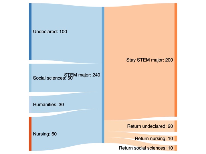
By showing the data this way, it is easy to just glance at the picture and see how well the program worked and what students did afterwards.
This is a very simple example, but Sankey Diagrams can be used to visualize complex or detailed data and tell a compelling story. The Pew Research Centers created this Sankey Diagram to show what college majors contribute to employment in a STEM occupation:
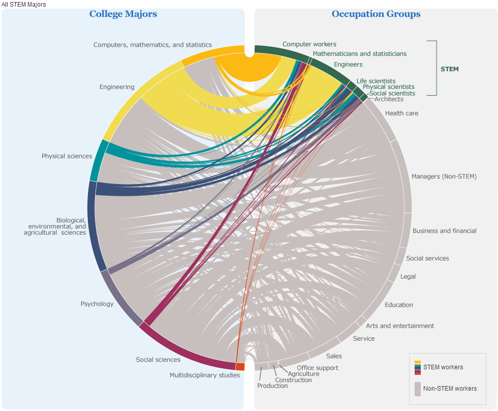
Just by looking at the colors, you can see, for example, that about half the students who major in engineering go in to a STEM occupation. You can also see that of the small percent of social science majors who go in to STEM fields, about half go in to an occupation related to computers.
Ready to try your hand at making a Sankey Diagram? There are some very easy-to-use free tools available:
- SankeyMATIC is a free online Sankey builder (and is the tool I used to make the first diagram in this post). It is very easy to use but does not work well for large data sets.
- Sankey Diagram is an iPad app that allows you to manipulate the nodes in your diagram. It is more flexible than many of the free online tools.
- E-Sankey is the tool of choice to visualize large or complex data, but it is not free. There is a trial version available so you can try before you buy.
- RAW is an open-source Sankey tool. There is a steep learning curve on this one, but if you are tech-savvy it might be worth trying. The graphic outputs it produces are top-quality.
Happy data visualizing!
Those charts look great and all, but I feel they may be more confusing to use than beneficial in many scenarios.