Gary Gereffi, Sociology, Arts & Sciences
Project Description
In Gereffi’s Marketing and Management capstone course, undergraduate students collect and analyze data involving several key North Carolina industries, helping Gereffi and his team (the Center on Globalization, Governance and Competitiveness) create visualizations like value chains and maps for the public and highly-visible North Carolina and the Global Economy website.
CIT provided funding and support to help Gereffi and his team develop interactive visualizations for the project. These visualizations included representations of value chains using tools like Adobe Flash, and an exploration of the use of mapping tools like Google Earth to rethink the way industry data can be presented visually in a more global context.
Re-visualizing Value Chains
Gereffi and his team consulted with CIT on several possible approaches to creating more interactive and visually appealing value chain diagrams. Key challenges included considering uniform color schemes and layouts (to create a common visual language between all value chains), and finding a solution for presenting data and textual content in context within the diagram, yet without cluttering the visual representation.
Making mappable data more accessible
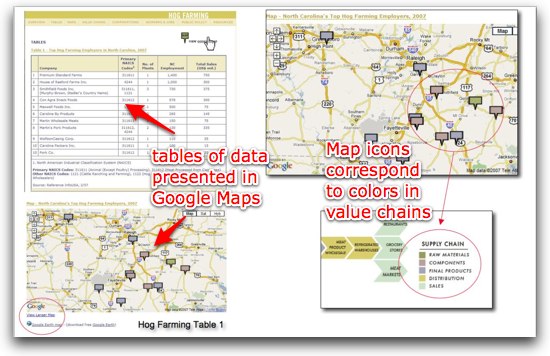
Google Maps and Google Earth have made it much easier to publish and share mappable data. Since much of the data collected by the Gereffi’s research team included location data, CIT worked with the team to use Google’s mapping tools to create clickable, interactive maps that could be included directly in context within webpages on the NCGE site. The team created custom icons with colors that corresponded to the colors of different aspects of the value chain.
The same mappable data used to create the Google Maps was also used to create Google Earth files. The Google Earth “virtual globe” browser allows users more flexibility to view, sort and zoom into locations. By providing the data as Google Earth files, users in the community and industry also have greater access to the data.
The following video is an excerpt from the presentation “Everybody’s Doing It: Web-based Visualizations and Mashups in the Social Sciences” which CIT consultant Shawn Miller gave at Duke’s Visualization Forum in September 2008. In the video, Miller describes several aspects of the project, and demos some of the unpublished visualization experiments that he and the team explored. The full video is available from the Visualization Forum website.
For more information, visit the North Carolina and the Global Economy website. The site also includes videos that demo many of the key features, including the value chains, Google Maps and Google Earth.
Project Started: May 4, 2007
Funding: $11,000


